Introduction
Power BI continues to evolve with exciting new features aimed at improving how we visualize, present, and understand data. In this edition of BI Buzz, we explore some of the latest updates that are transforming the data storytelling experience — from adding helpful annotations directly on PowerPoint slides, to enhanced reference lines that make analysis more insightful, and a brand- new card visual that brings more flexibility to your dashboards.
Let’s dive into each of these updates in detail!
1: What are Data Annotations in Power BI?
- Data Annotations for Power BI in PowerPoint is a new feature that lets you add notes or comments directly on Power BI visuals that are embedded in your PowerPoint slides.
Getting Power BI add-in for Power Point:
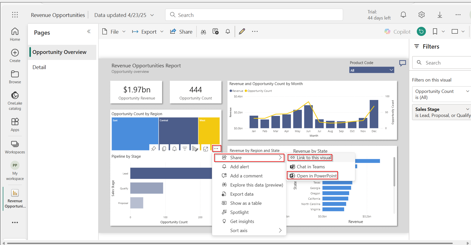
Step 1: Get the Link from Power BI
- Open Power BI Service using the link https://app.powerbi.com
- Choose the report that contains the visual you want to use in your presentation.
- Select your visual and click “More options” (three dots) on the visual.
- Then choose “Share” > “Link to this visual” or “Open in PowerPoint”.
- A link will be generated—click “Copy link”.
- Make sure the visual is shareable or you have proper permissions.
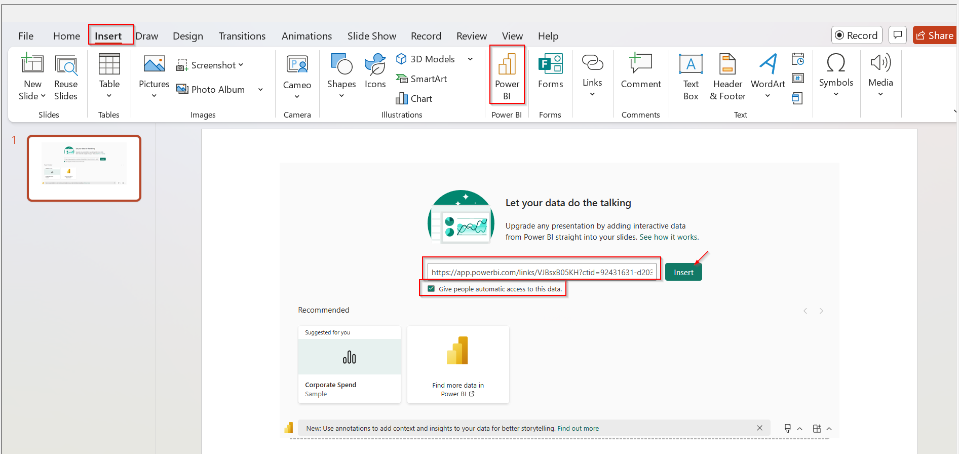
Step 2: Paste the Link in PowerPoint
- Open PowerPoint and go to the slide where you want the visual.
- Click Insert then choose Power BI and add it.
- Paste the copied link into the Power BI add-in box.
- Click Insert, and your visual will appear on the slide.
How to Create Annotations?
- Choose the data point (like a bar, line, or section of the chart) which you want to annotate.
- Right click on it and choose "Annotate"
- A small text box will pop up — type your note or comment in it.
- Using this "/" you can see the key points linked to that data point. Simply you can paste them by clicking on it.
- You can style the information and also move that text box to wherever you want.
Limitations and Considerations:
- Data annotations only work with single visuals not with entire page in the report.
- They don't support custom visuals.
- If the data updates and the data point is no longer part of the visual, the annotation will not be shown.
- If a data point is hidden because of a filter, its annotation will also be hidden.
- Annotations only show when the data point is visible.
2: Enhancements to Reference Lines
- Enhancement to reference lines allows us to add a line to our charts to highlight a specific value, like a target or average.
- This is useful for comparing data with goals, showing averages, marking key thresholds like budget limits, and providing context.
- So your audience can easily relate data to important benchmarks.
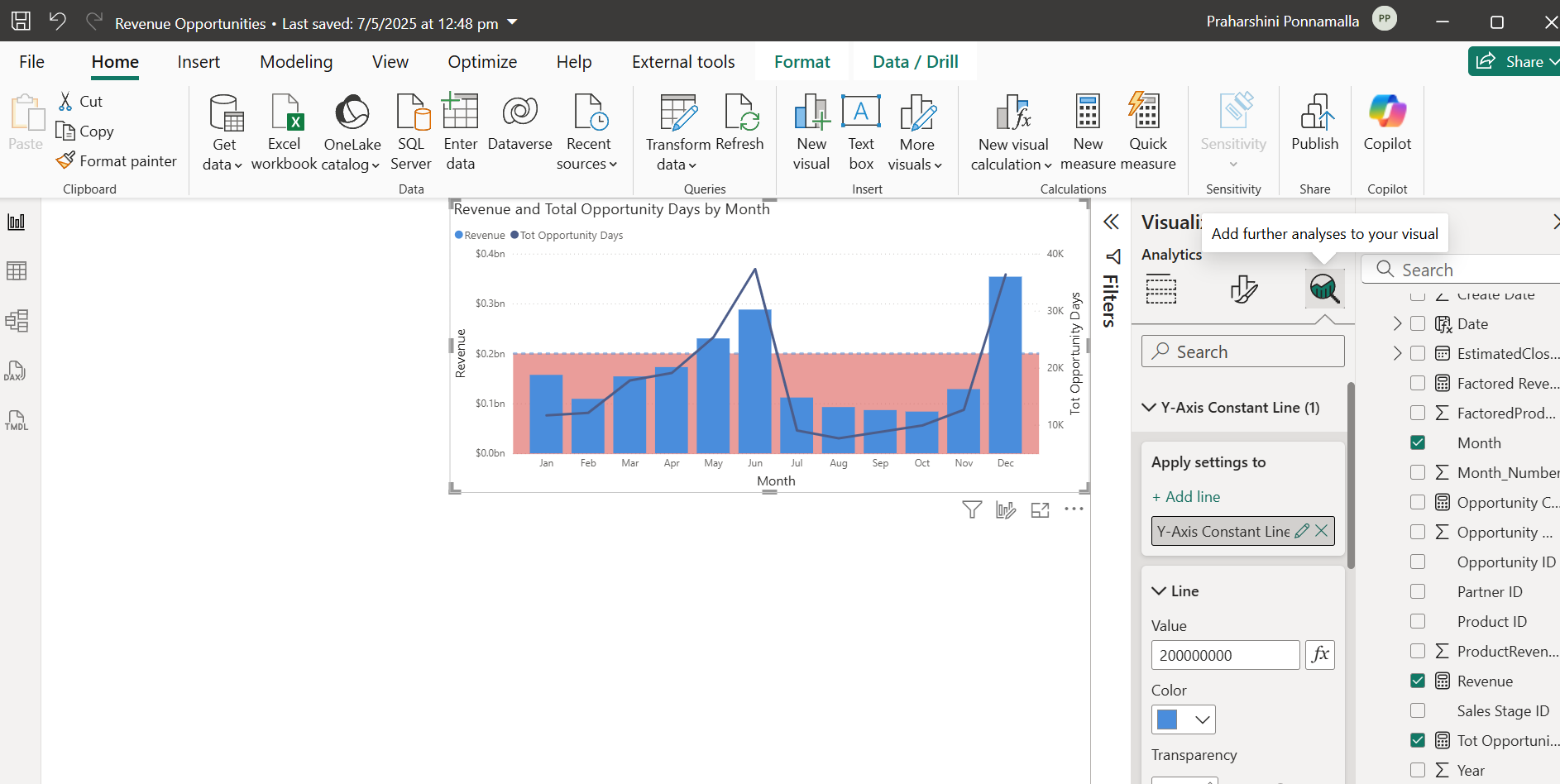
Key Features include:
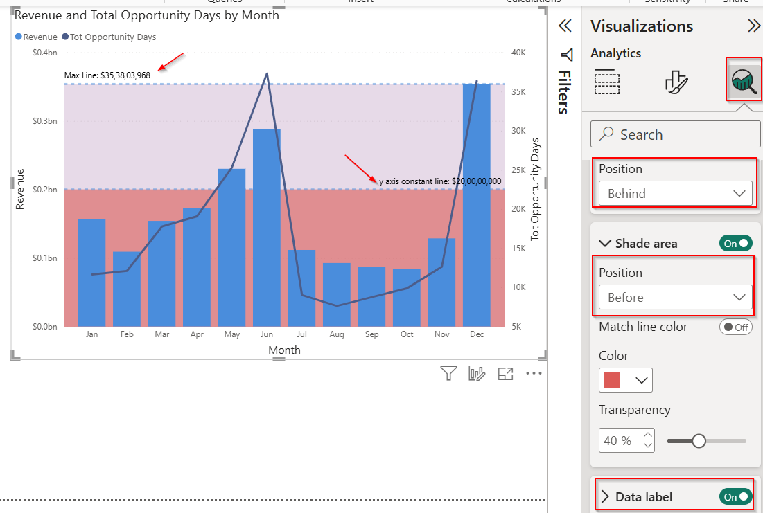
- You can now add shaded areas (bands) to highlight key value ranges.
- If the reference line is set behind the chart, the shaded band goes behind too.
- Y-axis reference lines are now supported in Line and stacked column and Line and clustered column charts.
- Dynamic reference lines like Min, Max, and Average are now available in Line and clustered column charts.
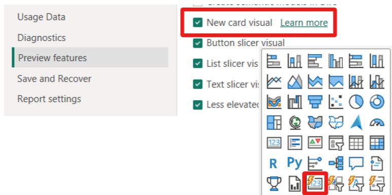
3: Category Enhancement in the New Card Visual (preview)
- It is introduced to enhance data presentation, replacing the classic and multi-row cards.
- This new visual supports small multiples, letting us display multiple categories in a single view for better comparison.
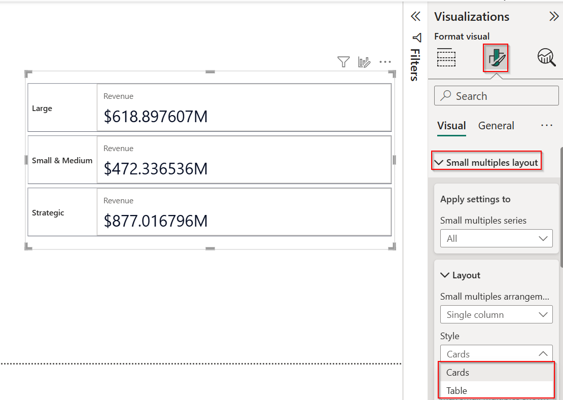
Key Features:
- It offers two layout styles – table and card – giving us more control over how information is displayed.
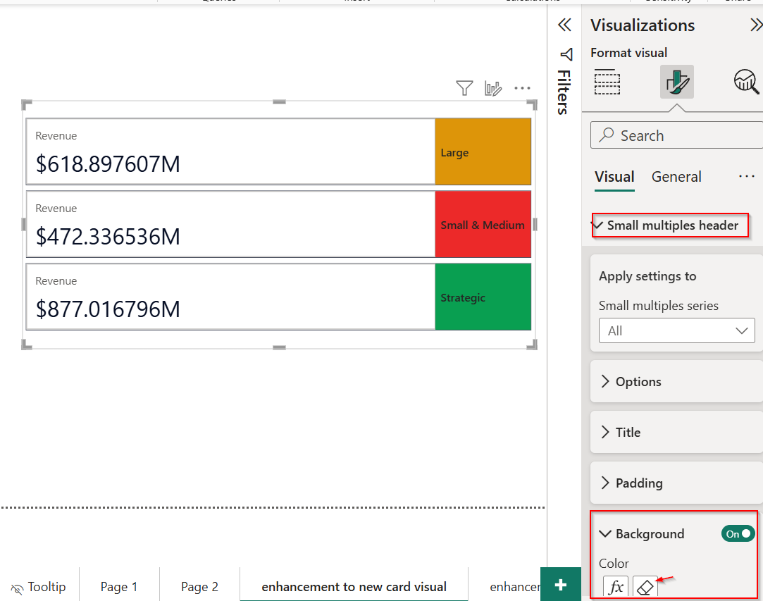
- We can now position headers on any side and adjust title orientation for cleaner design.
- Conditional formatting can be applied individually for each category, making insights stand out clearly.
- This feature is currently in preview and can be enabled through the Power BI options menu.
Conclusion
With these new capabilities, Power BI continues to evolve into a more intuitive and powerful analytics tool. The addition of data annotations makes presentations more interactive, reference line enhancements bring better context to visuals, and the updated card visuals offer cleaner, customizable layouts. These features are designed to simplify how users communicate data and drive impactful decisions with clarity and precision.